
Your Company’s Name On Your Logo: How To Make It Work?
Published by Arpin Gajjar,
To be or not to be? To do or not to do? Will or won’t it work? These three questions refer to one common problem while designing your future logo: whereas you should incorporate your company’s name into the logo or no. This is a really hard choice to make: if you do it in a wrong way, instead of a creative logo you’ll get something plain and strange. Not the brightest prospect, is it?
Firstly, think of the concept of your future logo. Do you want it to be just a picture, just a text or both? If both, think if the picture on your logo will correspond with the text you want to offer. Sometimes logos use even straplines in addition to their names but it happens not quite often. The reason for this is that you don’t have enough space to place everything you want. Your logo is a terse and precise description of your company’s concept. However, if you, for example, have a coffee shop, your logo shouldn’t necessarily contain a cup of coffee on it. The concept in this case is a much more extensive notion. Your logo should attract your clients, seduce them in a way they want to visit your coffee shop and buy your coffee, as far as they understand that it’s something new, different and impressive. Your logo has to be eloquent telling your clients your product is worth trying. In order to fulfil this aim, the logo must be creative, otherwise nobody will get interested in your business. Adding your company’s name into such logo makes your task even twice harder but, if done properly, the result will be really worth it. Your logo will be much better recognized and, therefore, you’ll get much more clients. Now, let’s think of some examples of companies that incorporated their names into the logos and didn’t lose.
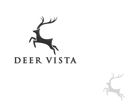
Deer Vista is a luxury residential home community in Park City Utah. Its refined style is connected with breathtaking nature, mountains and freedom that the community suggests to its residents. Deer Vista wanted its future logo to emphasize on the company’s deep relations with nature and at the same time to depict its luxury and nobility. The logo for the company was created by one of the freelance designers on the platform designcontest.com (this platform allows you to make designers compete for the task offering you loads of creative options). Among all the other suggestions the company chose the minimalistic deer which creates an impression of movement due to its shadow on the left corner below. The most interesting part is the way the company’s name got incorporated into the logo: due to its minimalistic design and the excellent font there’s a feeling that the name is a harmonious continuation of the deer. Without it the logo will lose its identity. That’s why it’s one of the greatest examples of how your company’s name on the logo works for you.
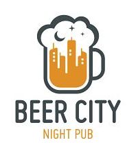
Beer City Night Pub
There are plenty of night pubs with great logos in each and every nook of the world but try to find those that managed to be so creative as Beer City Night Pub. The company succeeded in creating a logo that combined the whole name in one visual picture. A pilsner glass filled with foaming beer, a busy city and a night sky with moon and stars: it was hard to combine but the result was truly perfect. However, even being such a creative combination there was no guarantee that it would work: this visual impression needed to be explained. The solution was quite simple: having added its name into a logo using proper colors and an interesting font, the company ended up being an owner of a striking logo.
Or is it Sminsewellya? Or Syasminlewel? Not completely sure because it’s barely readable. The company’s website has something to do with fashion. Yes, “something to do" - it’s all I could find out about it. Along with a horrible logo it has got a not quite clear website but let’s get back to its logo. This is a great example of what you cannot do if you want to incorporate your company’s name into your future logo and make it creative: you cannot choose a terrible font that is almost impossible to read; you cannot place such text into a circle (though round shapes are one of the most popular design solutions in 2017, don’t abuse them). Finally, make sure your potential clients can actually read what they see on your logo. The main idea about adding your company’s name into the logo is for your clients to get to know your brand. Your logo is responsible for your brand awareness, remember that!

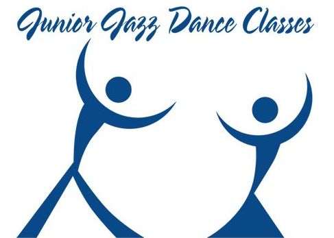
Junior Jazz Dance Classes
Instead of thinking how to incorporate their name into the logo, these dance classes should have thought of how to make their logo a little bit more acceptable for kids. If we don’t pay attention to the picture that creates the whole visual impression (though it would be extremely hard to do) and look precisely at the text we’re interested in, we’ll notice the first mistake: a terrible font and its color. The font is hard to read and the color of the text is neither catchy nor intriguing. Perhaps, the reason for the picture below the text is to rivet all the attention, so that nobody will notice the designer’s fail in terms of text.
As you see, incorporating your company’s name into your logo is a very tough thing to do. If your logo designers and you spend hours on on thinking of the proper picture, adding a text is even harder: it should be in balance with an expected visual image and not fall out of it. If you choose a wrong font, a wrong color or a wrong size of letters, the impression will be broken and the result will be hideous. There are even cases when your company’s name isn’t simply necessary. However, if you do everything as it’s supposed to be, the result will be inspiring.